If you try to imagine your favorite magazine right now, you will probably have a clear picture in your mind. It doesn’t matter if it’s a fancy fashion magazine or a local publication about knitting. You can see one particular issue that caught your attention or a general layout that you remember. The number of possible variants is truly endless.
Whatever image you have got in your head, there is almost a 100% chance that you thought about the magazine’s cover. It’s no surprise that covers stay in our memories since their primary target is to draw the audience’s attention and highlight the most valuable content.
That is why you should consider the cover’s structure and design from the very beginning. An eye-pleasing cover is one of the most crucial factors for your magazine’s success. We offer you a list of tips that will help you reach your goal and attract the target audience to each and every issue.
Pay attention to the title
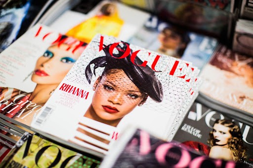
Title matters. It matters not only as a reflection of the magazine’s mission but also as a visual element of the cover. First of all, you need to place the title, or masthead, on the clearly visible part of the page. Usually, the title is located at the top so the reader’s eyes will see and recognize it immediately.
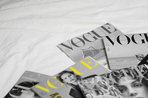
Another interesting way to emphasize the title is to use 3D text. When the title is creatively merged with a photo or an illustration, it makes a unique and catchy impression.
Experiment with fonts
The title and the background image are not the only elements of the cover. You will need to put more text on the first page to highlight the content of the issue. Sure, it’s impossible to use the same font style and size that was used for the masthead. That is why you should think about correct font pairings.
Using various combinations of italics, bold, colorful fonts will add more creativity and style to your magazine. It’s an efficient way to fascinate and engage the audience.
Use colors
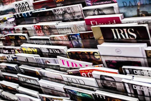
Another way to become more visible on the shop’s rack is to add some colorful accents. It shouldn’t be a random shade from a palette: Choosing colors for a magazine cover requires some design effort. Before thinking about contrast, you should define your background image. It will be a foundation for other decor elements.
Also, don’t go too enthusiastic about it: The number of additional colors should stay healthy in order not to overwhelm the readers.
Be consistent…
When designing a magazine cover, keep in mind that this template will be used almost all the time. The final template is not absolute and you can adjust it to the main topic of the issue, but the most important core elements should stay in the same places all the time.
Functional magazine mockups can help you with creating the general concept. With their help, you can see what your cover and page design will look like in real life.
… but don’t be afraid to break the rules
Rules are good, but following them can become boring and predictable. Sometimes you can add some spice to your magazine and set your imagination free. When something out-of-the-ordinary happens, you have all the rights to pivot from your common cover layout and highlight the event with unusual illustrations or different font styles.
To sum it all up
The whole list of requirements for a good magazine cover can continue further. Besides, each niche has its own peculiarities that you need to take into account. However, following the rules we mentioned above, you will definitely create a powerful and beautiful cover that will catch the eye of a potential reader.

